noUiSlider
noUiSlider is a range slider without bloat. It offers a ton off features, and it is as small, lightweight and minimal as possible, which is great for mobile use on the many supported devices, including iPhone, iPad, Android devices & Windows (Phone) 8 desktops, tablets and all-in-ones. It works on desktops too, of course!
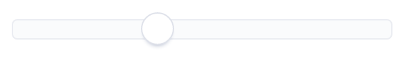
<nouislider bc-slider-1="20" />
Configuration
Sliders (Mandatory)
The bc-slider-* attribute defines an handle and its start position. The bc-slider-* attribute is a dictionary attribute and can be assigned multiple times (in this case the * must be replaced by a unique identifier, e.g. bc-slider-1).
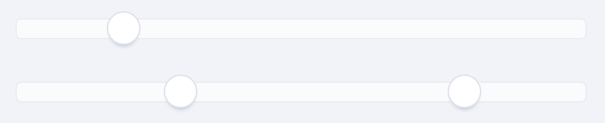
<nouislider bc-slider-1="20" />
<nouislider bc-slider-1="30.5" bc-slider-2="80" />
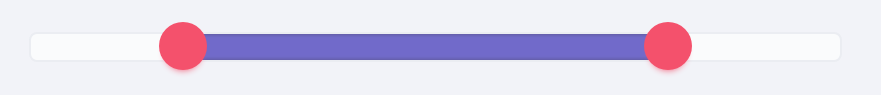
Connectors
A connector is the space between two handles or between a handle and the start respectively the end point of a slider. These spaces can be filled with one color. Use the bc-connectors attribute to define these spaces as a connector or not. The connectors will be defined with a comma-separated list of Boolean values.
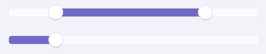
<nouislider bc-slider-1="20" bc-slider-2="80" bc-connectors="false,true,false" />
<nouislider bc-slider-1="20" bc-connectors="true,false" />
Color
With the noUiSlider Tag Helper it is possible to colorize the handles and the connectors of a slider. Set a color for all handles with the bc-color-sliders attribute.
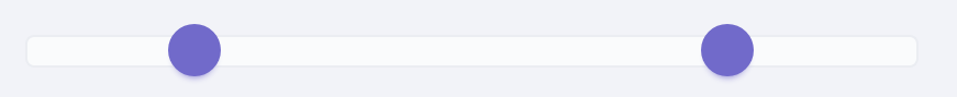
<nouislider bc-slider-1="20" bc-slider-2="80" bc-color-sliders="Brand" />
To set a color for the connectors use the bc-color-connectors attribute.
<nouislider bc-slider-1="20" bc-slider-2="80" bc-connectors="false,true,false" bc-color-sliders="Danger" bc-color-connectors="Brand" />
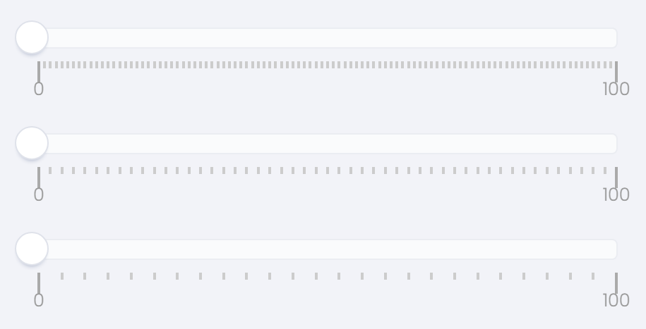
Step
By default, the slider slides fluently. In order to make the handles jump between intervals, you can set the bc-step attribute. The interval is specified as an integer.
Minimum
Set the minimum value of the slider with the bc-min attribute. By default, the minimum is set to 0.
Maximum
Set the maximum value of the slider with the bc-max attribute. By default, the maximum is set to 100.
Margin
When using two handles, the minimum distance between the handles can be set using the bc-margin attribute. The margin value is relative to the value set in bc-min and bc-max. This option is only available on linear sliders.
Limit
The bc-limit attribute is the oposite of the bc-margin attribute, limiting the maximum distance between two handles. As with the bc-margin attribute, the limit option can only be used on linear sliders.
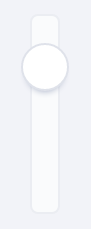
Orientation
The orientation of the slider can be set by the bc-orientation attribute. Possible values are Horizontal (default) or Vertical. Vertical sliders don't assume a default height, so you'll need to set one. You can use any unit you want, including % or px.
<nouislider bc-slider-1="20" bc-orientation="Vertical" style="height: 100px;" />
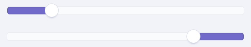
Direction
By default the sliders are top-to-bottom and left-to-right, but you can change this using the bc-direction attribute, which decides where the upper side of the slider is. Possible directions are Ltr (default) or Rtl.
<nouislider bc-slider-1="20" bc-connectors="true,false" />
<nouislider bc-slider-1="20" bc-connectors="true,false" bc-direction="Rtl" />
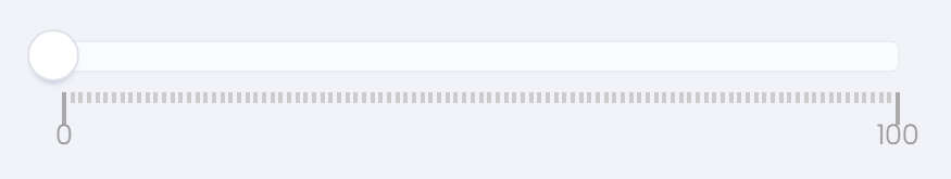
Scale / Pips
To improve the overview, a noUiSlider can be extended with a scale and pips. There are several ways to define scales / pips.
Modes
A scale for the noUiSlider can be defined in several modes. The mode of the scale is be defined with the bc-pips-mode attribute. Possible modes are Range, Steps, Positions, Count and Values.
Range
The Range mode uses the slider range to determine where the pips should be. A pip is generated for every percentage specified.
<nouislider bc-slider-1="0" bc-pips-mode="Range" />
Steps
In Steps mode, a pip is generated for every step of the slider defined with the bc-step attribute. In addition, each pip of a step still gets a label with the respective value.
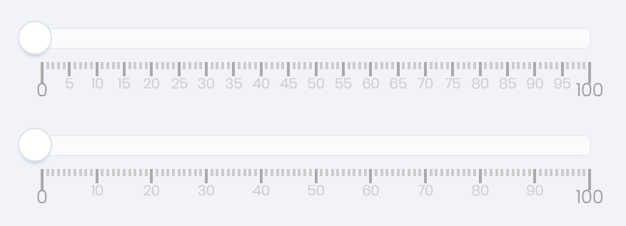
<nouislider bc-slider-1="0" bc-pips-mode="Steps" bc-step="5" />
<nouislider bc-slider-1="0" bc-pips-mode="Steps" bc-step="10" />
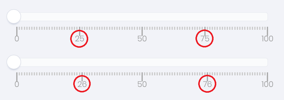
Positions
In Positions mode, pips are generated at percentage-based positions on the slider.
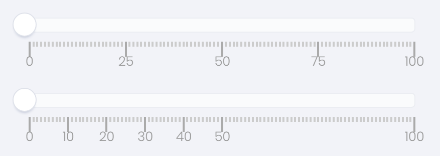
<nouislider bc-slider-1="0" bc-pips-mode="Positions" bc-pips-values="0, 25, 50, 75, 100" />
<nouislider bc-slider-1="0" bc-pips-mode="Positions" bc-pips-values="0, 10, 20, 30, 40, 50, 100" />
Count
The Count mode can be used to generate a fixed number of pips.
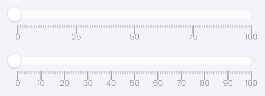
<nouislider bc-slider-1="0" bc-pips-mode="Count" bc-pips-values="5" />
<nouislider bc-slider-1="0" bc-pips-mode="Count" bc-pips-values="11" />
Values
The Values mode is similar to Positions, but it accepts values instead of percentages.
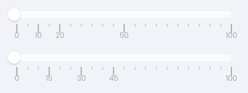
<nouislider bc-slider-1="0" bc-pips-mode="Values" bc-pips-values="0, 10, 20, 50, 100" />
<nouislider bc-slider-1="0" bc-pips-mode="Values" bc-pips-values="0, 15, 30, 45, 100" />
Density
The density value controls how many pips are placed on one percent of the slider range. With the default value of 1, there is one pip per percent. For a value of 2, a pip is placed for every 2 percent. A value below one will place more than one pip per percentage.
<nouislider bc-slider-1="0" bc-pips-mode="Range" />
<nouislider bc-slider-1="0" bc-pips-mode="Range" bc-pips-density="2" />
<nouislider bc-slider-1="0" bc-pips-mode="Range" bc-pips-density="4" />
Stepped
By setting the bc-pips-stepped attribute to true, the pip values will be round to the slider stepping.
<nouislider bc-slider-1="0" bc-pips-mode="Positions" bc-step="2" bc-pips-values="0, 25, 50, 75, 100" />
<nouislider bc-slider-1="0" bc-pips-mode="Positions" bc-step="2" bc-pips-values="0, 25, 50, 75, 100" bc-pips-stepped="true" />
Data Binding
View
The noUiSlider Tag Helper provides the dictionary attribute asp-for-* to bind a view model property to a slider. The attribute can be assigned multiple times within one Tag Helper. For this, only the * is to be replaced by the name of the slider:
<form asp-controller="Slider" asp-action="NoUiSlider" method="post">
    <form-group>
        <nouislider asp-for-1="Slider1" asp-for-2="Slider2" />
    </form-group>

    <button type="submit">Post Data</button>
</form>
View Model
public class NoUiSliderViewModel
{
    public double Slider1 { get; set; }

    public double Slider2 { get; set; }
}
Controller
public class SliderController : Controller
{
    public IActionResult NoUiSlider()
    {
        // Instance a view model with default slider values
        NoUiSliderViewModel model = new NoUiSliderViewModel { Slider1 = 33.3, Slider2 = 66.6 };

        return View(model);
    }

    [HttpPost]
    public IActionResult NoUiSlider(NoUiSliderViewModel model)
    {
        // Read value of first Slider
        var sliderValue1 = model.Slider1;

        // Read value of second Slider
        var sliderValue2 = model.Slider2;

        return View(model);
    }
}