Progress
The progress is a information bar to show a progress. Use the Mecons Tag Helper to build those components with all known features.

<progress bc-value="75" />
Configuration
Value
Use the bc-value attribute to set a value for the progress.
Label
Add a label to your progress bar and set the bc-label attribute to true.

<progress bc-value="75" bc-label="true" />
Size
Set a size for the progress with the bc-size attribute. Possible sizes are Default, Small or Large.
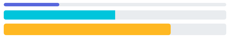
<progress bc-value="25" bc-color="Primary" bc-size="Small" />
<progress bc-value="50" bc-color="Accent" />
<progress bc-value="75" bc-color="Warning" bc-size="Large" />
Height
It's possible to adapt the height of a progress bar with the bc-height attribute. Allowed values for this attribute are integers. The unit for this value are pixels (px).
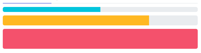
<progress bc-value="25" bc-color="Primary" bc-height="1" />
<progress bc-value="50" bc-color="Accent" bc-height="10" />
<progress bc-value="75" bc-color="Warning" bc-height="20" />
<progress bc-value="100" bc-color="Danger" bc-height="40" />
Color
Use the bc-color attribute to set a color for the progress bar.
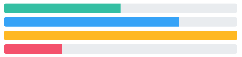
<progress bc-value="50" bc-color="Success" />
<progress bc-value="75" bc-color="Info" />
<progress bc-value="100" bc-color="Warning" />
<progress bc-value="25" bc-color="Danger" />
Striped
Add the bc-striped attribute and set it to true to apply a stripe gradient over the progress bar's background color.

<progress bc-value="25" bc-color="Success" bc-striped="true"  />
<progress bc-value="50" bc-color="Info" bc-striped="true" />
<progress bc-value="75" bc-color="Warning" bc-striped="true"  />
<progress bc-value="100" bc-color="Danger" bc-striped="true"  />
Animated
The striped gradient can also be animated by setting the bc-animated attribute to true.