Popover
A Popover is a component to show additional informations for an element like those found in iOS. With the Mecons Tag Helper it is possible to add those informations to any element on your app.
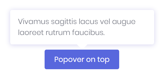
<button type="button" bc-popover="Vivamus sagittis lacus vel augue laoreet rutrum faucibus.">
    Popover on top
</button>
Configuration
Content (Mandatory) (Trigger Attribute)
The bc-popover attribute is available on each HTML element and specifies the popover content. After these attribute is set for an element further attributes are available to concretize the popover definition.
<button type="button" bc-popover="Text and content">Button with Popover</button>
Title
You can set a title for the popover with the bc-popover-title attribute.
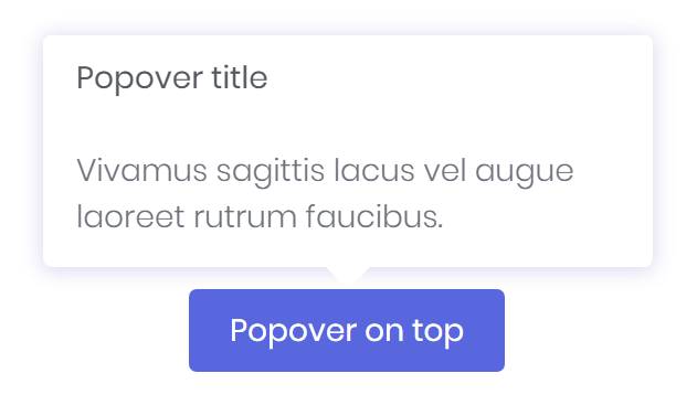
<button type="button" bc-popover="..." bc-popover-title="Popover title">
    Popover on top
</button>
Dismissible
Use the bc-popover-dismissible attribute and set a focus trigger to dismiss popovers on the next click that user makes.
Delay
Define a delay for showing and hiding the popover with bc-popover-delay attribute. The value of these attribute are milliseconds.
<button type="button" bc-popover="Text and content" bc-popover-delay="1000">Button with Popover</button>
Placement
With the bc-popover-placement can specified how to position a popover. Possible values are Top (default), Bottom, Left or Right.
HTML
Set the bc-popover-html attribute to true to allow HTML tags within the popover content.

<button type="button" bc-popover="And here's some amazing <b>HTML</b> content. It's very <code>engaging</code>. Right?" bc-popover-html="true">
    Popover with HTML
</button>