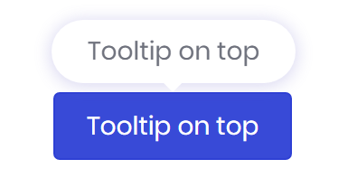
Tooltip
Tooltips are components to add further informations to an element.

<button type="button" bc-tooltip="Tooltip on top">Tooltip on top</button>
Configuration
Text (Mandatory) (Trigger Attribute)
The bc-tooltip attribute is available on each HTML element and specifies the tooltip text. After these attribute is set for an element further attributes are available to concretize the tooltip definition.
<button type="button" bc-tooltip="Text and content">Button with Tooltip</button>
HTML
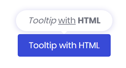
Not only text can be displayed within a tooltip, also HTML enriched content is allowed. To allow and render HTML tags within a tooltip use the bc-tooltip-html attribute.

<button type="button" bc-tooltip="<em>Tooltip</em> <u>with</u> <b>HTML</b>"
    bc-tooltip-html="true">Tooltip with HTML</button>
Animation
By default, a tooltip comes up with an animation (fade effect). If you don't want this effect you can disable it by setting the bc-tooltip-animation attribute to false.
Delay
Define a delay for showing and hiding the tooltip with bc-tooltip-delay attribute. The value of these attribute are milliseconds.
<button type="button" bc-tooltip="Text and content" bc-tooltip-delay="1000">Button with Tooltip</button>
Placement
With the bc-tooltip-placement can specified how to position a tooltip. Possible values are Top (default), Bottom, Left or Right.