Daterangepicker
The Daterangepicker Tag Helper is a JavaScript component for choosing date ranges, dates and times.

<daterangepicker bc-label="Start Time" />
Configuration
Start and End Date
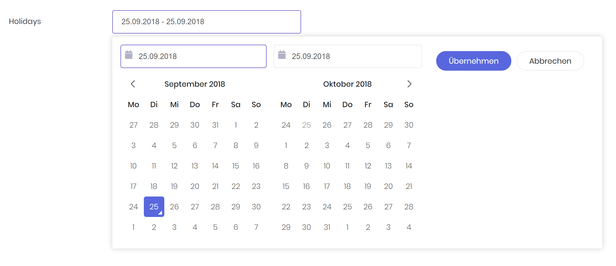
Use the bc-start-date attribute to set the beginning date of the initially selected date range. With the bc-end-date attribute set the end date of the initially selected date range.

<daterangepicker bc-label="Holidays" bc-start-date="@DateTime.Now" bc-end-date="@DateTime.Now.AddDays(14)" />
Min and Max Date
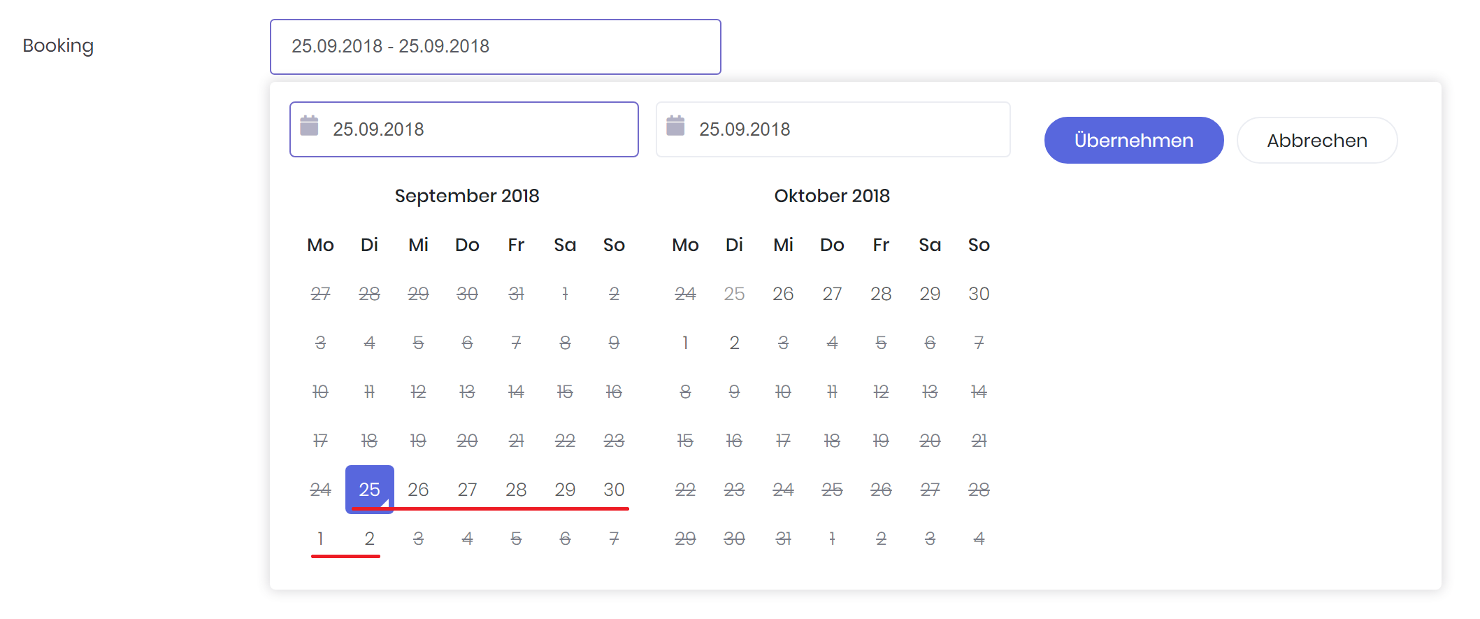
Set the earliest date a user may select with the bc-min-date attribute. To set the latest date use the bc-max-date attribute.

<daterangepicker bc-label="Booking" bc-min-date="@DateTime.Now.AddDays(-7)" bc-max-date="@DateTime.Now.AddDays(7)" />
Format
The date format can be specified with the bc-format attribute. The format is specified as C# date and time format string.

<daterangepicker bc-label="Default Format" />
<daterangepicker bc-label="Specific Format" bc-format="dd/MM/yyyy" />
Timepicker
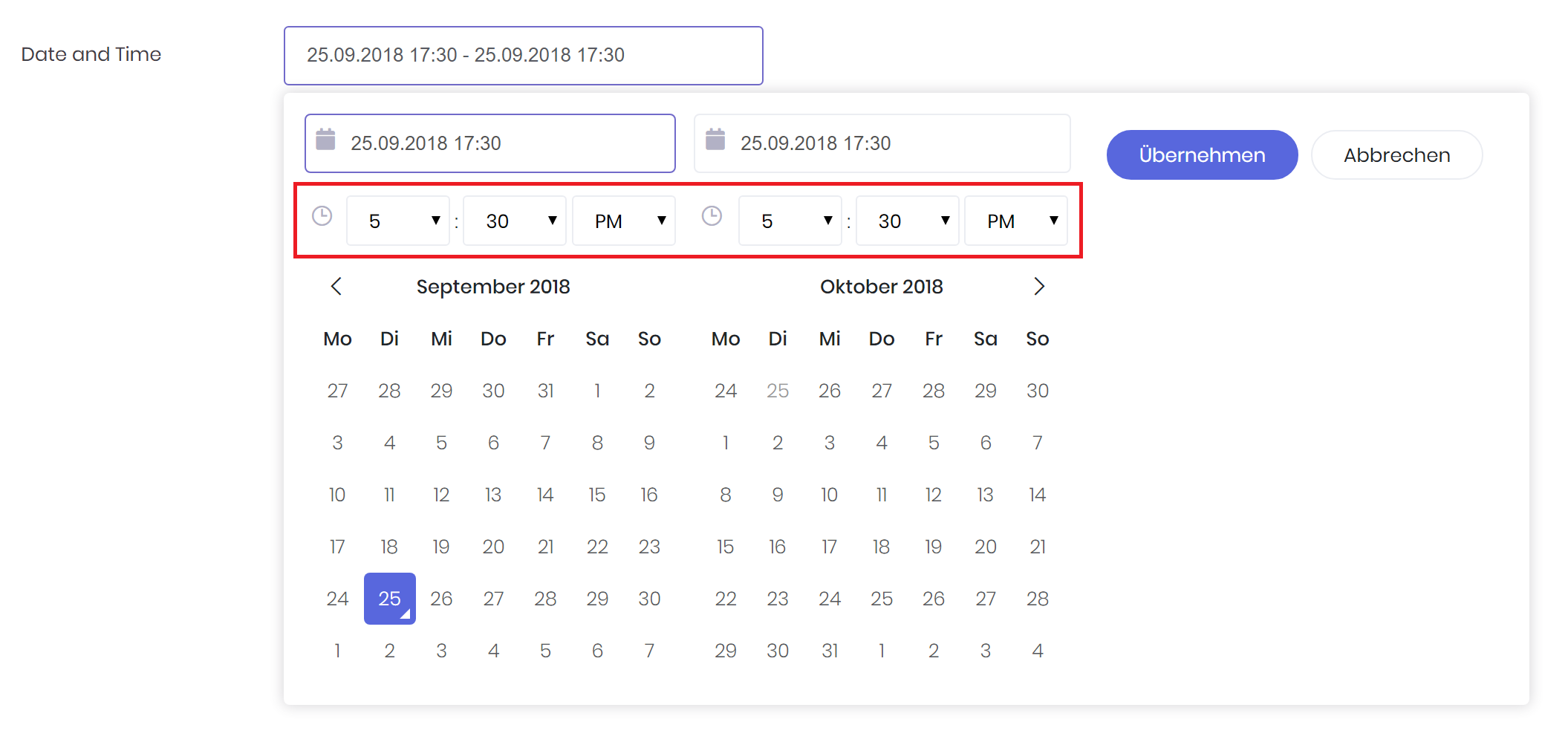
Set the bc-timepicker attribute to true to add select boxes to choose times in addition to dates.
In addition use the bc-timepicker-step attribute to set the increment steps of minutes selection list (i.e. 30 to allow only selection of times ending in 0 or 30). By default, the increment of minutes is 30.

<daterangepicker bc-label="Date and Time" bc-timepicker="true" bc-timepicker-step="15" />
Icon
Set an icon addon for the daterangepicker with the bc-icon attribute.

<daterangepicker bc-label="Holidays" bc-icon="FA_Calendar" />
Button Color
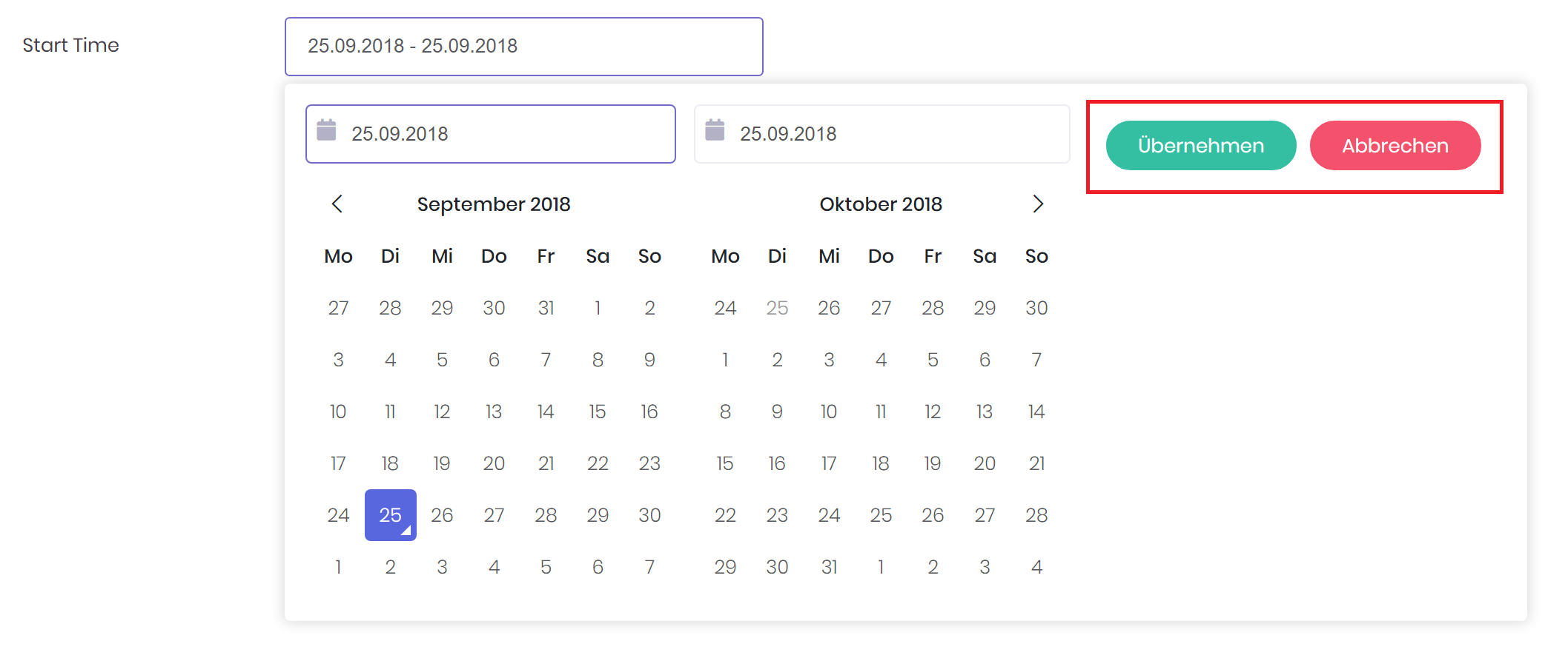
Use the bc-apply-color and bc-cancel-color attribute to define a color for the corresponding button. By default, the Apply Button color is Primary and the Cancel Button color is Secondary.

<daterangepicker bc-label="Start Time" bc-apply-color="Success" bc-cancel-color="Danger" />
Data Binding
The Daterangepicker Tag Helper provides two properties for the start date and end date data binding. The start date can be bound to the asp-for attribute while the end date is bound to the asp-for2 attribute.

<!-- VIEW -->
<form asp-action="CallbackAction" method="post">
    <form-group>
        <daterangepicker asp-for="StartDate" asp-for2="EndDate" bc-format="dd/MM/yyyy" />
    </form-group>
</form>
// MODEL
[Display(Name = "Timespan", Description = "Please enter a timespan here.")]
public DateTime StartDate { get; set; } = DateTime.Now.AddDays(-3);

public DateTime EndDate { get; set; } = DateTime.Now.AddDays(3);