Text (Single-line Input)
The text input will be specified with a <input type="text" /> tag and provides a single-line text input field.
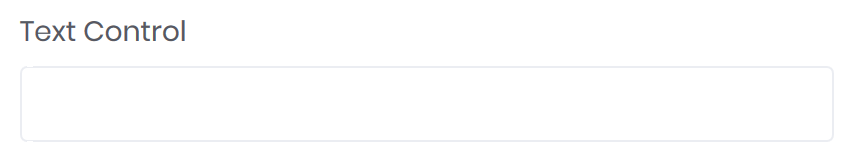
<input type="text" bc-label="Text Control" />
Configuration
Addons
Place an text add-on on each side of an text input with the bc-pre-text or bc-post-text attribute.
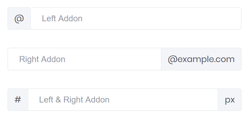
<form-group>
    <input type="text" placeholder="Left Addon" bc-pre-text="@" />
</form-group>
<form-group>
    <input type="text" placeholder="Right Addon" bc-post-text="@example.com" />
</form-group>
<form-group>
    <input type="text" placeholder="Left & Right Addon" bc-pre-text="#" bc-post-text="px" />
</form-group>
To add an icon on left or right side of an input control, use the bc-pre-icon or bc-post-icon attribute.
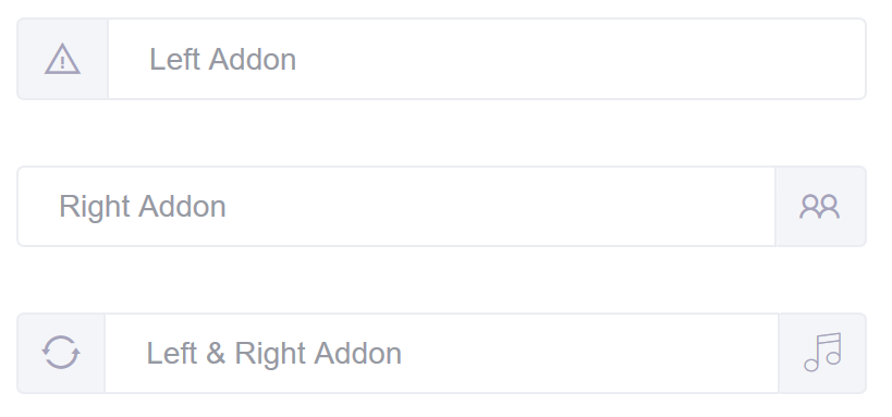
<form-group>
    <input type="text" placeholder="Left Addon" bc-pre-icon="LA_ExclamationTriangle" />
</form-group>
<form-group>
    <input type="text" placeholder="Right Addon" bc-post-icon="LA_Group" />
</form-group>
<form-group>
    <input type="text" placeholder="Left & Right Addon" bc-pre-icon="FI_Refresh" bc-post-icon="FI_Music1" />
</form-group>
Please note: These attributes only working on input controls of type text, password, email or number.