Controls
The Mecons Controls are a collection of default HTML form controls and extended components with appealing styles.
General Configuration
The following configuration attributes are available for all form controls respectively their tag helpers.
Label
Define a label for form controls by adding the bc-label attribute or use the <label> tag helper within the <form-group>.
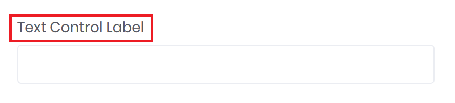
<!-- Label via form control attribute -->
<form-group>
    <input type="text" bc-label="Text Control Label" />
</form-group>

<!-- Label via label tag helper -->
<form-group>
    <label>Text Control Label</label>
    <input type="text" />
</form-group>
Help
A block-level help text for form controls can be created by using the bc-help attribute or use the <help> tag helper within the <form-group>.
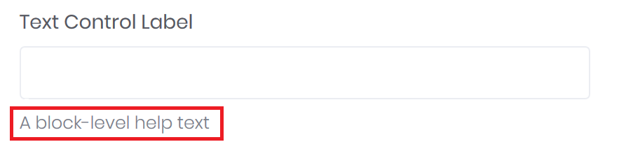
<!-- Block-level help via form control attribute -->
<form-group>
    <input type="text" bc-label="Text Control Label" bc-help="A block-level help text" />
</form-group>

<!-- Block-level help via help tag helper -->
<form-group>
    <input type="text" bc-label="Text Control Label" />
    <help>A block-level help text</help>
</form-group>
Size
Set the height of a form control by adding the bc-size attribute. Available sizes are Default, Large or Small.
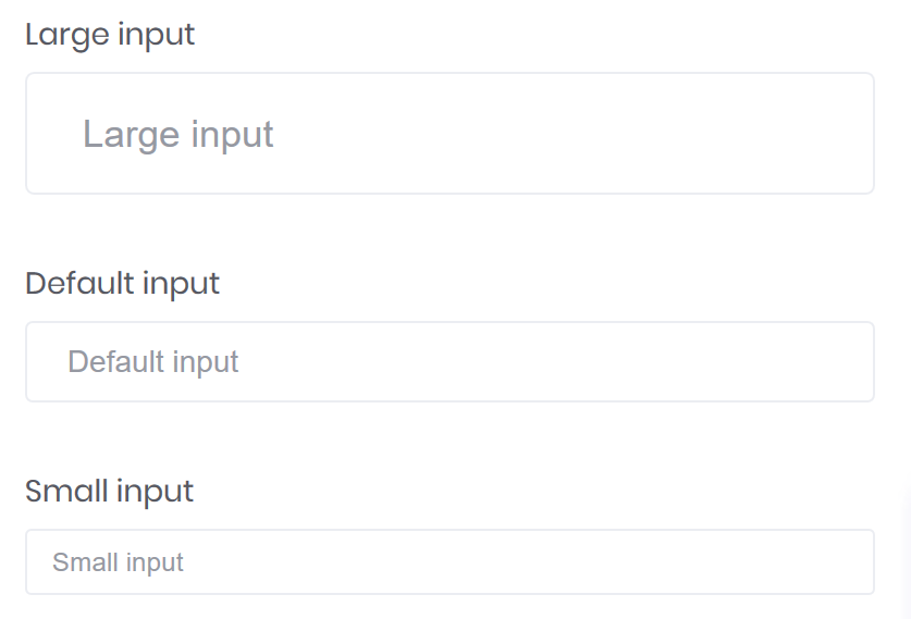
<form-group>
    <input type="text" bc-label="Large input" placeholder="Large input" bc-size="Large" />
</form-group>
<form-group>
    <input type="text" bc-label="Default input" placeholder="Default input" />
</form-group>
<form-group>
    <input type="text" bc-label="Small input" placeholder="Small input" bc-size="Small" />
</form-group>
Required
Mark a control as required with the bc-required attribute. This adds the HTML required attribute to the control markup und mark the control label as required with a star (*).
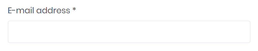
<form-group>
    <input bc-label="E-mail address" bc-required="true" type="text" />
</form-group>
Data Binding
All Mecons Form Controls supports the standardized data binding approach of ASP.NET Core. That means that all Mecons Tag Helpers in a form context provides a asp-for attribute.
Validation
If a property is bound to the control (via asp-for attribute) and the bc-validation attribute is set to true, a validation message element will be displayed on invalid state. These element can be used from the validation mechanism of ASP.NET MVC.
Note
It is also possible to activate the validation messages for each form control by an form level attribute. For more info check the Validation page. It is also possible to activate the validation messages for each form control by an form level attribute. For more info check the Validation page.