Datepicker
The Datepicker provides a flexible datepicker widget in the Bootstrap style.
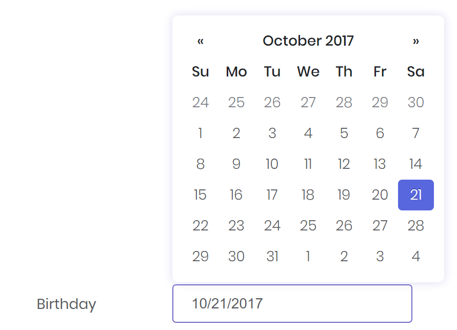
<datepicker bc-label="Birthday" />
Configuration
Orientation
The bc-orientation attribute allows to set a fixed placement of the datepicker popup. By default, the orientation is Auto and the picker will be placed smart.
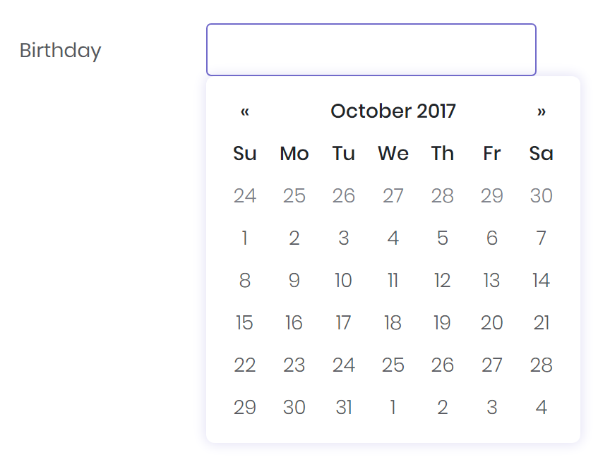
<datepicker bc-label="Birthday" bc-orientation="BottomLeft" />
Icon
Set an icon addon for the datepicker with the bc-icon attribute.
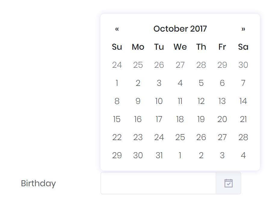
<datepicker bc-label="Birthday" bc-icon="LA_CalendarCheckO" />
Auto Close
Set the bc-close attribute to true to close the datepicker popup immediately when a date is selected.
Calendar Weeks
Set the bc-weeks attribute to true to show week numbers to the left of week rows.
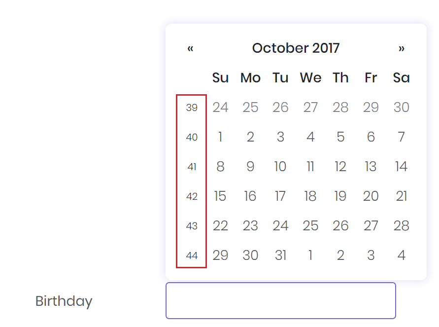
<datepicker bc-label="Birthday" bc-weeks="true" />
Date Format
Set a date format for the datepicker with the bc-format attribute. To specify a custom date format use the default C# Date and Time Format Strings.
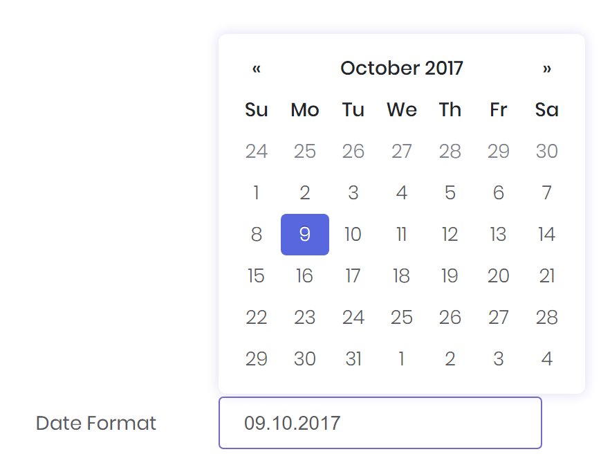
<datepicker bc-label="Date Format" bc-format="dd.mm.yyyy" />
Start and End Date
Specify the earliest date that may be selected with the bc-start-date attribute. All earlier dates will be disabled.
Specify the latest date that may be selected with the bc-end-date attribute. All later dates will be disabled.
The date should be in local timezone and the string must be parsable with the JavaScript Date Formats.
<!-- Disable all dates before today -->
<datepicker bc-label="Start Date" bc-start-date="0d" />

<!-- Disable all dates after today -->
<datepicker bc-label="End Date" bc-end-date="0d" />