Dropdown Button
Dropdown Buttons are contextual overlays for displaying lists of links and more.

<button-dropdown bc-title="Primary">
    <a href="#">Action</a>
    <a href="#" bc-disabled="true">Disabled Action</a>
    <a href="#">Another Action</a>
</button-dropdown>
<button-dropdown bc-title="Secondary" bc-color="Secondary">
    ...
</button-dropdown>
Components
Components are tag helpers that are available within a <button-dropdown>.
Menu Item
The <a> tag represents an item within the dropdown menu. These regular HTML link tag is extended by a Mecons tag helper which provides further attributes.
Divider
The <divider> tag helper helps you to seperate groups of related menu items.
Header
With the <header> tag helper it is possible to add a header to label sections of actions in any dropdown menu.
Configuration
Title (Mandatory)
The bc-title attribute specifies a title for the button that triggers the dropdown menu.
Dropup
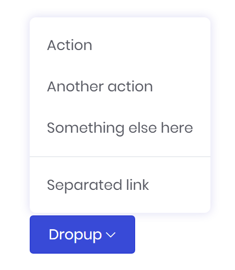
Set the bc-dropup attribute to trigger the dropdown menu above the button.

<button-dropdown bc-title="Dropup" bc-dropup="true">
    ...
</button-dropdown>
Color
Use the bc-color attribute to modify the styling of the dropdown button. Possible styles are Primary (default), Secondary, Success, Danger, Warning, Info, Light or Dark.

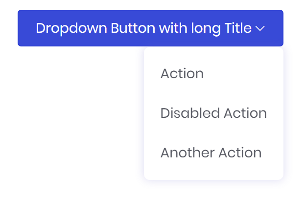
<button-dropdown bc-title="Dropdown Button with long Title" bc-alignment-right="true">
    ...
</button-dropdown>
Size
Add the bc-size attribute to define a size for the dropdown button. Possible sizes are Default, Large or Small.

<button-dropdown bc-title="Large Dropdown" bc-size="Large">
    ...
</button-dropdown>

<button-dropdown bc-title="Normal Dropdown">
    ...
</button-dropdown>

<button-dropdown bc-title="Small Dropdown" bc-size="Small">
    ...
</button-dropdown>
Split
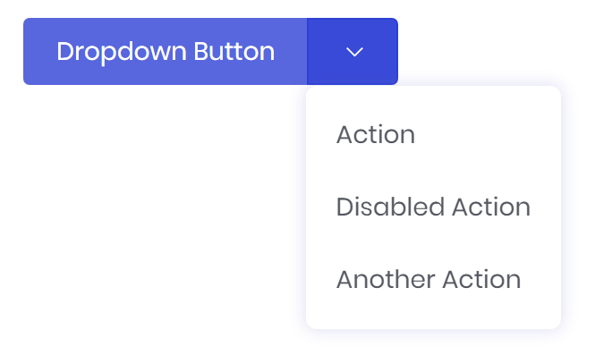
The bc-split attribute seperates the dropdown menu trigger from the rest of the button. This make it possible to allocate an seperate action to the button.

<button-dropdown bc-title="Dropdown Button" bc-split="true">
    ...
</button-dropdown>
Menu Item Configuration
Disable
Add the bc-disable attribute to disable an menu item in the dropdown.