Button
Buttons are elements for actions in forms, dialogs and more. With the Mecons Tag Helper it is very easy to use these Buttons and adjust them to your needs.

<button type="button">Primary</button>
<button type="button" bc-color="Secondary">Secondary</button>
...
Configuration
Color
Use the bc-color attribute to modify the styling of the button.
Outline
In need of a button, but not the hefty background colors they bring? Set the bc-outline attribute to true to remove all background images and color on any button.

<button type="button" bc-outline="true">Primary</button>
<button type="button" bc-outline="true" bc-color="Secondary">Secondary</button>
...
Style
Render a button in different styles by setting the bc-style attribute. Possible values are Default, Square or Pill.

<button type="button">Default</button>
<button type="button" bc-style="Square">Square</button>
<button type="button" bc-style="Pill">Pill</button>
Size
Add the bc-size attribute to define a size for the button. Possible sizes are Default, Large or Small.

<button type="button" bc-size="Large" bc-color="Primary">Large button</button>
<button type="button" bc-color="Secondary">Default button</button>
<button type="button" bc-size="Small" bc-color="Success">Small button</button>
Wide
Use the bc-wide attribute to enlarge the paddings of the button.

<button type="button" bc-color="Success" bc-wide="true">Success</button>
<button type="button" bc-color="Danger" bc-wide="true">Danger</button>
Block
Create block level buttons - those that span the full width of a parent - by adding the bc-block attribute.

<button type="button" bc-block="true" bc-color="Primary">Primary</button>
<button type="button" bc-block="true" bc-color="Success">Success</button>
Active
Buttons will appear pressed (with a darker background, darker border, and inset shadow) when the bc-active attribute is set to true.
Disable
Make buttons look inactive by adding the bc-disable attribute and set it to true.
Icon
It is also possible to equip the button with an icon, which is displayed next to the description text. For this purpose, an icon can be defined with the bc-icon attribute.

<button type="button" bc-color="Primary" bc-icon="FA_Archive">Primary</button>
<button type="button" bc-color="Secondary" bc-icon="FA_User">Secondary</button>
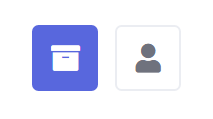
If a button has no description, only the icon is displayed as an icon-only button.

<button type="button" bc-color="Primary" bc-icon="FA_Archive"></button>
<button type="button" bc-color="Secondary" bc-icon="FA_User"></button>
Link Configuration
Button (Trigger Attribute)
You can also use the button attributes with <a> tags and render a link like a button. To do that it is important to set the trigger attribute bc-button for a link.
<a bc-button="true" bc-color="Primary">Primary</a>