Portlet
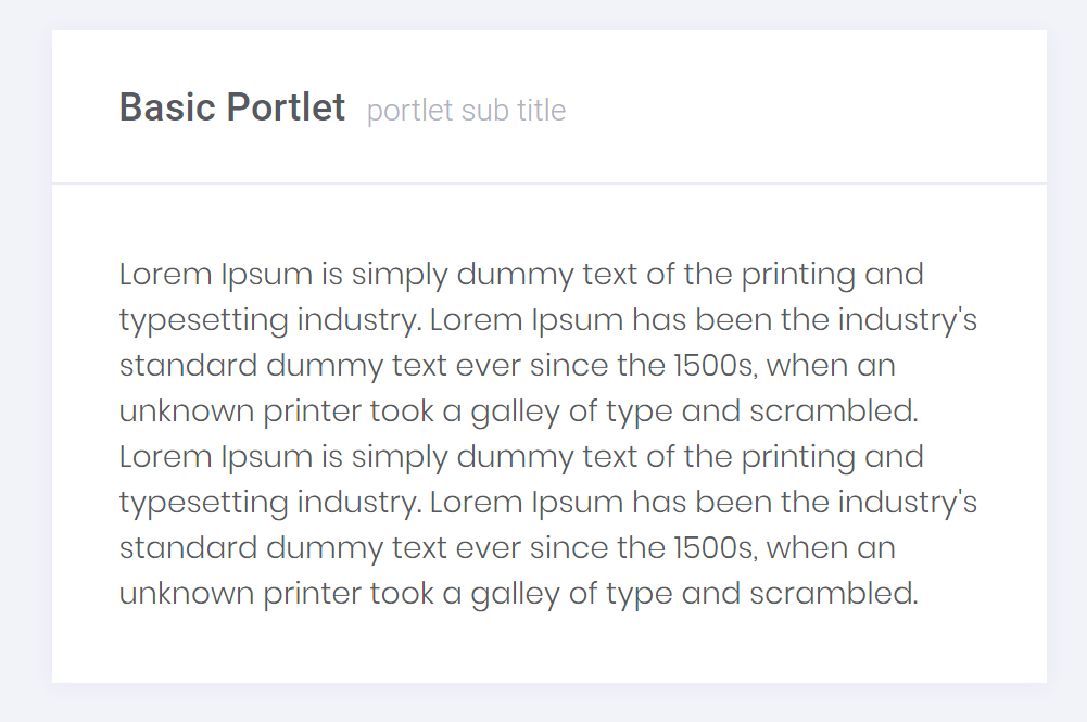
Portlets are complex containers for content, actions and small navigations.

<portlet>
    <portlet-header bc-title="Basic Portlet" bc-subtitle="portlet sub title"></portlet-header>
    <portlet-body>
        ...
    </portlet-body>
</portlet>
Components

<portlet>
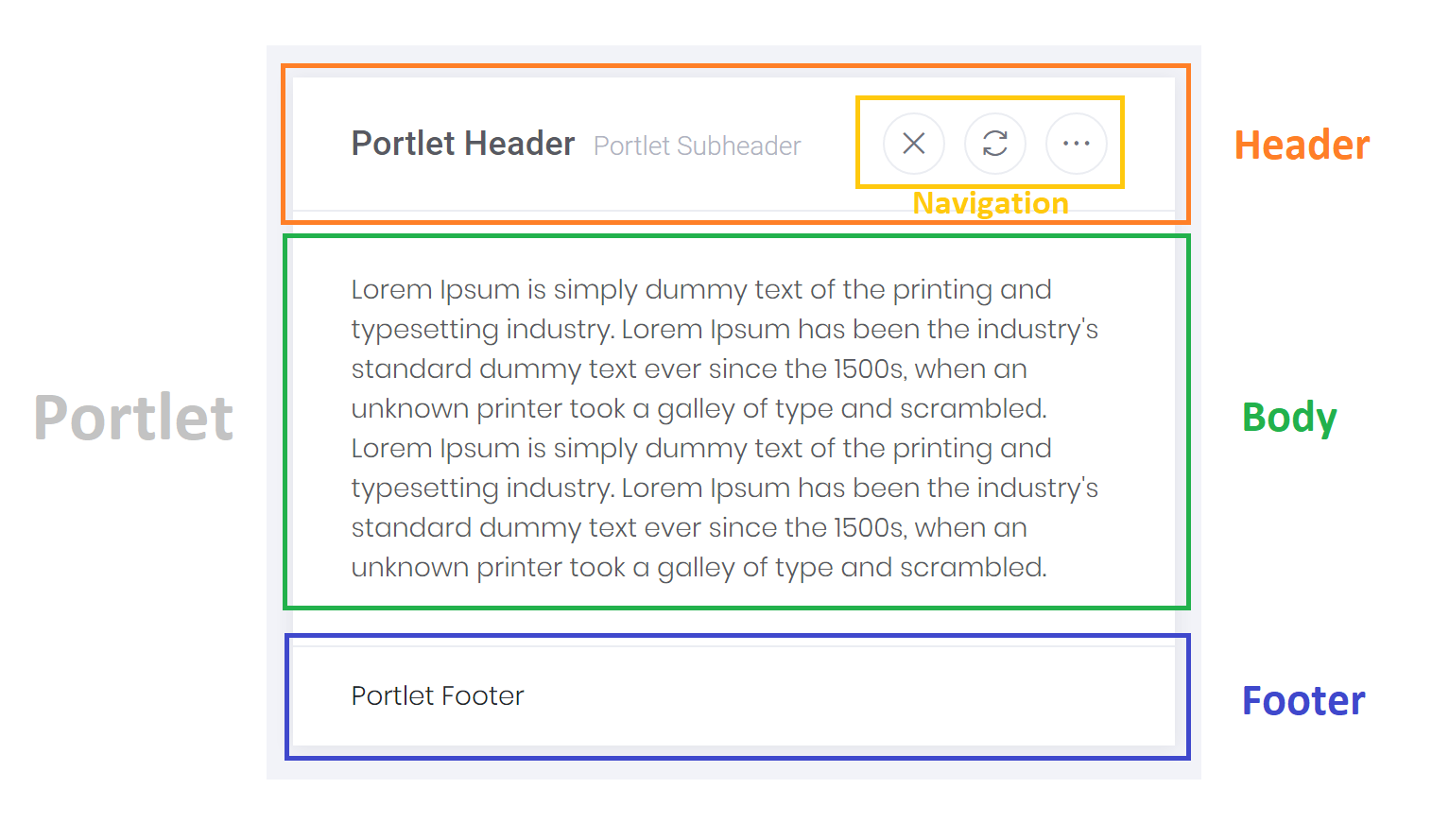
    <portlet-header bc-title="Portlet Header" bc-subtitle="Portlet Subheader">
        <portlet-nav>
            <portlet-link href="#" bc-icon="LA_Close" />
            <portlet-link href="#" bc-icon="LA_Refresh" />
            <portlet-link href="#" bc-icon="LA_EllipsisH" />
        </portlet-nav>
    </portlet-header>
    <portlet-body>
        ...
    </portlet-body>
    <portlet-footer>
        Portlet Footer
    </portlet-footer>
</portlet>
Header
A header for the portlet can added with the <portlet-header> tag helper. A header can contain a simple title with additional subtitle, an icon or a navigation.
Body
The body tag helper is the main container for portlets' content and can be added with <portlet-body>.
Footer
Some portlets need a footer to show detailed informations about the content. A footer can be added to the portlet with the <portlet-footer> tag helper.
Navigation
A portlet navigation can be added with the <portlet-nav> tag helper as a part of the header. A navigation, in turn, can contain many control elements (e.g. portlet-link).
Navigation Link
A portlet navigation can be added with the <portlet-nav> tag helper as a part of the header. A navigation, in turn, can contain many control elements (e.g. portlet-link).
Configuration
Round
Define round corners for the portlet by setting the bc-round attribute to true.
Shadow
Disable the shadow for the portlet by setting the bc-shadow attribute to false. By default, a portlet has a shadow and the attribute is set to true.
Border
Outline the portlet with a border by setting the bc-border attribute. Possible border styles are None (default), Full or Semi.

<!-- Portlet with no border and shadow -->
<portlet bc-shadow="false"> ... </portlet>

<!-- Portlet with full border -->
<portlet bc-shadow="false" bc-border="Full"> ... </portlet>

<!-- Portlet with semi border -->
<portlet bc-shadow="false" bc-border="Semi"> ... </portlet>
Theme
Define a theme for the portlet with the bc-theme attribute. Possible themes are Default, Dark and Light.
Background
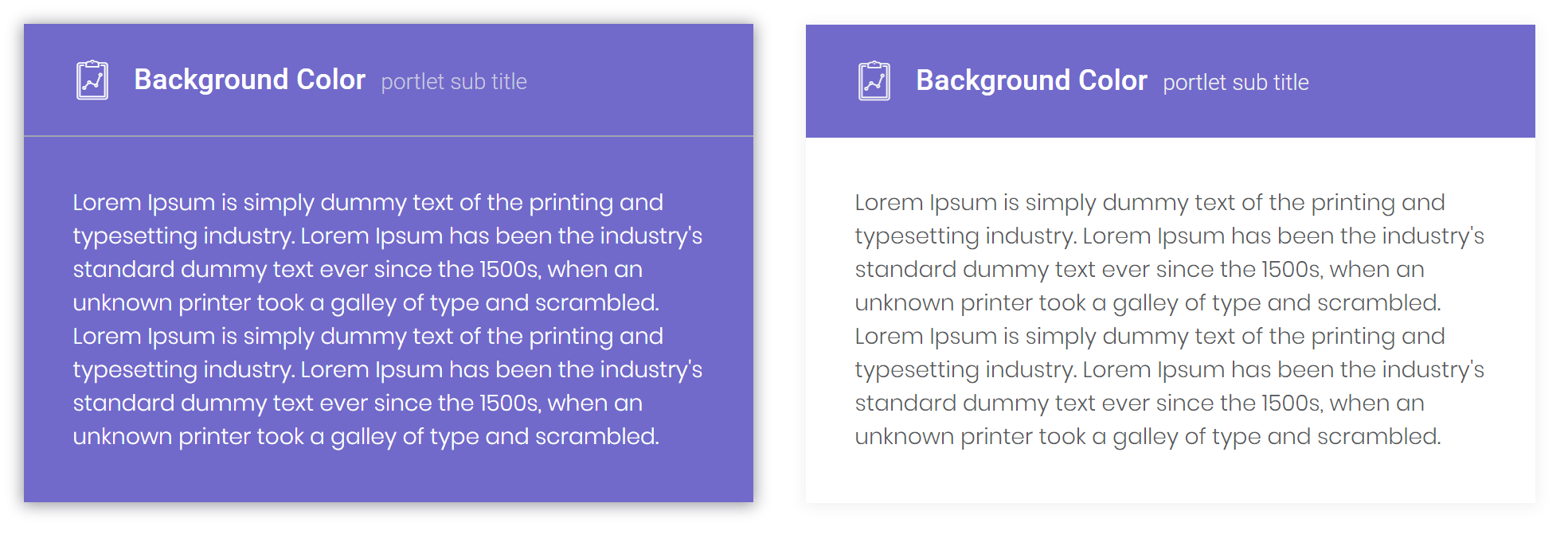
Set a background color for the portlet with the bc-background attribute. By default the portlet has None background color.
In addition use the bc-background-style attribute to set the background color only for the header (HeadOnly) or for the complete portlet (Full).

<!-- Portlet with full background -->
<portlet bc-theme="Dark" bc-background="Brand"> ... </portlet>

<!-- Portlet with only header background -->
<portlet bc-background="Brand" bc-background-style="HeadOnly"> ... </portlet>
Header Configuration
Titles
Use the bc-title attribute to set a header text for the portlet. In addition it is possible to set a subtitle for the portlet with the bc-subtitle attribute.
Icon
With the bc-icon attribute it is possible to define a icon for the portlet which is displayed in the header.
Color
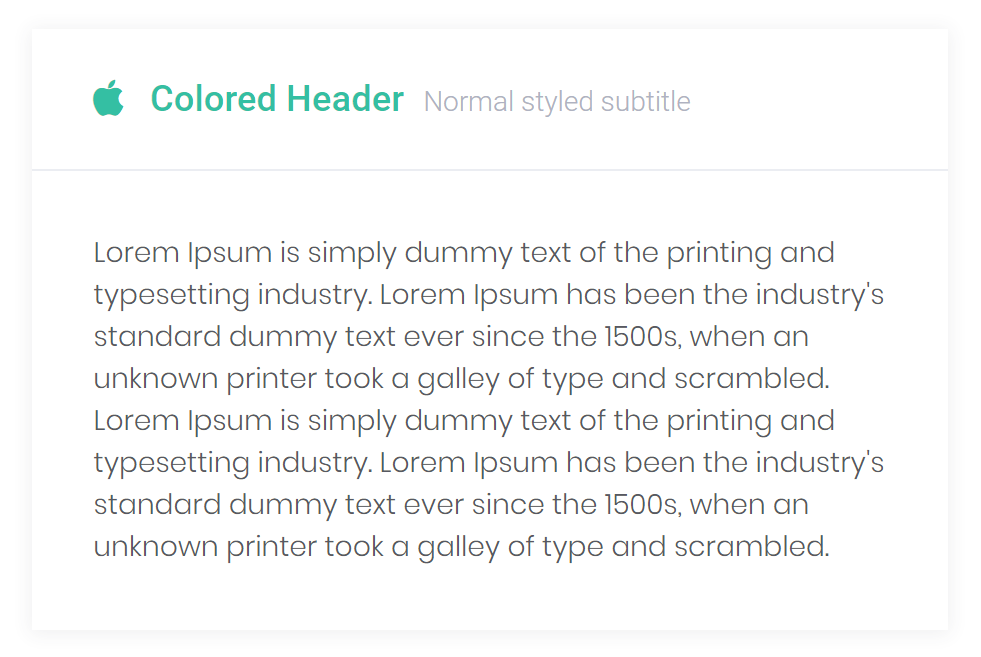
Use the bc-color attribute to define a font color for the title and icon of the portlet header. By default, the color is Dark.

<portlet>
    <portlet-header bc-icon="FA_Apple" bc-color="Success" bc-title="Colored Header" bc-subtitle="Normal styled subtitle"></portlet-header>
    <portlet-body> ... </portlet-body>
</portlet>