Modal
Use a Modal to add dialogs to your site for lightboxes, user notifications, or completely custom content. These quite complex component is capsuled within a Mecons Tag Helper and is very easy to use!
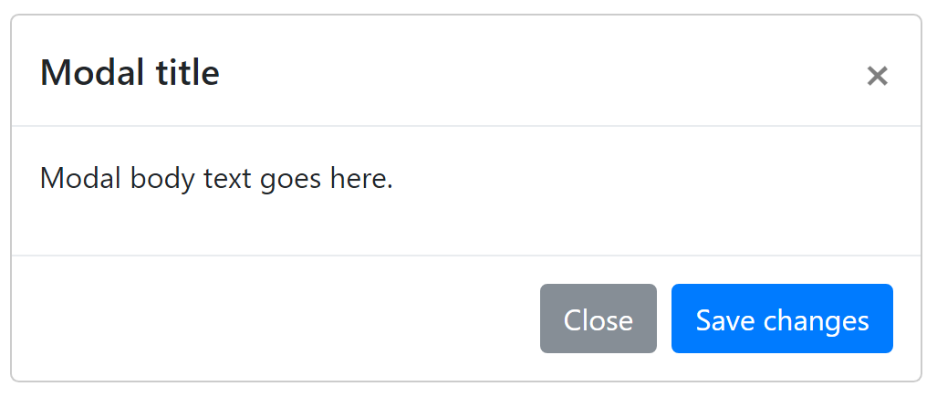
<modal bc-title="Modal title" bc-toggle-text="Launch modal">
    <modal-body>
        Modal body text goes here.
    </modal-body>
    <modal-footer>
        <button type="button" data-dismiss="modal">Close</button>
        <button type="button">Save changes</button>
    </modal-footer>
</modal>
Components
Components are tag helpers that are available within a <modal>.
Header
A modal dialog header can optionally added with a <modal-header> tag helper within the <modal> element.
Body
The <modal-body> tag helper is the core of an <modal> and within you can define the content of the modal dialog. These tag helper is mandatory for a correct modal rendering.
Footer
A modal dialog footer can optionally added with a <modal-footer> tag helper within the <modal> element.
Configuration
Toggle Text
The <modal> automatically renders a toggle button for the modal dialog. The prerequisite for this is that the bc-toggle-text attribute has been set. This attribute defines the name for the toggle button.
Leave the attribute empty or do not set it at all, then only the modal dialog without a button will be rendered.
Toggle Color
The <modal> automatically renders a toggle button for the modal dialog. With the bc-toggle-color attribute it is possible to define a color for the toggle button.
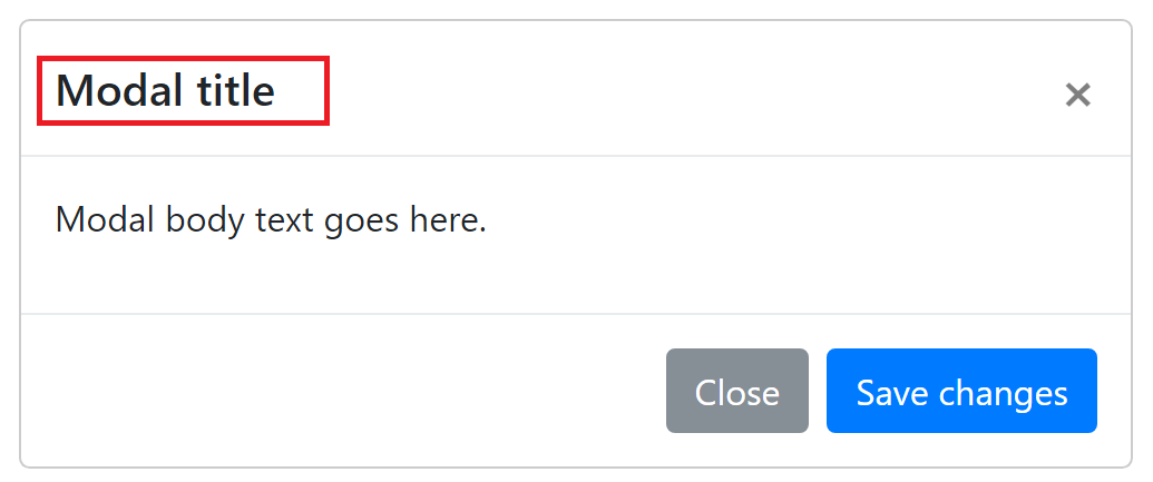
Title
There are two ways to define a title for a modal dialog. The easiest way is to set a title with the bc-title attribute. The second way is to specify an header tag (e.g. <h2>) within the <modal-header>.
<modal bc-title="Modal title" bc-toggle-text="Launch modal">
    ...
</modal>

<modal bc-toggle-text="Launch modal">
    <modal-header>
        <h2>Modal title</h2>
    <modal-header>
</modal>
Size
Modals have two optional sizes, available via bc-size attribute. Allocatable are the sizes Small, Default and Large.
Position
Modals can be display both at the top of a page and in the middle. Use the bc-position attribute to specify the modal position. Possible positions are Top (default) and Center.
Header Configuration
Disable Close Button
To hide the modal dialog close button set the bc-disable-close-icon attribute.
Body Configuration
Height
Set a maximum height for the <modal-body> with the bc-height attribute. If the content overflows the maximum body height a scrollbar will shown. Allowed values for this attribute are integers. The unit for this value are pixels (px).