Badge
Badges are small count and labeling components.
<h2>My Messages <badge bc-color="Info">12</badge></h2>
Configuration
Color
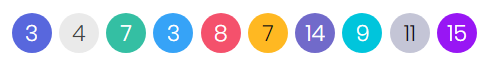
For proper styling of a badge use the bc-color attribute.
<badge>3</badge>
<badge bc-color="Secondary">4</badge>
<badge bc-color="Success">7</badge>
<badge bc-color="Info">3</badge>
<badge bc-color="Danger">8</badge>
<badge bc-color="Warning">7</badge>
<badge bc-color="Brand">14</badge>
<badge bc-color="Accent">9</badge>
<badge bc-color="Metal">11</badge>
<badge bc-color="Focus">15</badge>
Style
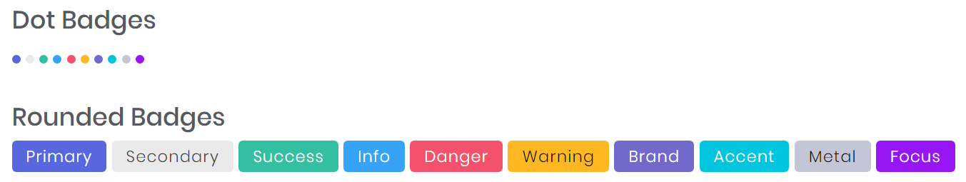
Use the bc-style attribute to set a style for the badge. Possible styles are Default, Dot or Round.
<h5>Dot Badges</h5>
<badge bc-style="Dot" bc-color="Primary"></badge>
<badge bc-style="Dot" bc-color="Secondary"></badge>
...

<h5>Rounded Badges</h5>
<badge bc-wide="true" bc-style="Round" bc-color="Primary">New</badge>
<badge bc-wide="true" bc-style="Round" bc-color="Secondary">Pending</badge>
...
Wide
Use the bc-wide attribute to enlarge the paddings of the badge.
<badge bc-wide="true" bc-color="Primary">New</badge>
<badge bc-wide="true" bc-color="Secondary">Pending</badge>
...